目录
一、问题
二、原因及解决方法
三、总结
如嫌繁琐,可直接移步至总结
一、问题
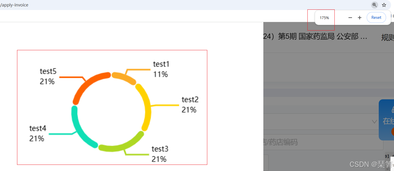
1.统计页面中多处用到echarts渲染统计图,在高分辨的大屏幕下 统计图及内部文字显示模糊
如下图所示:
二、原因及解决方法
1.模糊原因:为了能够渲染echarts图形,设置了固定的宽度和高度。而且高度和宽度必须设置。
2.echarts默认使用 canvas渲染,高分辨下会失真,改为 svg 渲染即可(不同分辨率下都不会失真)
3.具体方法:
echarts.init(echartRef.value, null, {renderer: 'svg'})4.具体代码如下:
<template><div class="purchase-drug-type rounded-t-2xl"><div class="flex items-center justify-center pb-24px pl-10px flex-auto bg-white rounded-2xl w-[400px] h-[300px]"><div ref="echartRef" class="echart w-full h-[264px]"></div></div></div>
</template><script lang="ts" setup>
import { onMounted, ref, computed } from 'vue'
import * as echarts from 'echarts'import type { Module4 } from '@/api/chainBoard.api'const props = withDefaults(defineProps<{ module: Module4; unit: string }>(), {unit: '%'
})
// const chartData = computed(() => {
//   return props.module?.propotion?.map((element) => ({
//     name: element.drugTypeName,
//     value: element.ratio
//   }))
// })const echartRef = ref(null)
let myChart = ref()
onMounted(async () => {await initData()
})function initData() {myChart.value = echarts.init(echartRef.value, null, {render: 'svg'})myChart.value.setOption({tooltip: {trigger: 'item',formatter: (params: any) => {return `<div style="display:flex;justify-content:space-between;align-items:center"><div style="margin-right:16px"><span style="display:inline-block;margin-right:2px;border-radius:10px;width:10px;height:10px;background-color:${params.color};"></span><span >${params.name}</span></div><div>${params.value}${props.unit}</div></div>`}},color: ['#FCAB25', '#FFD200', '#AED823', '#10DFB5', '#FE6200', '#91cc75', '#fac858', '#ee6666', '#73c0de'],series: [{type: 'pie',radius: ['50%', '59%'],avoidLabelOverlap: true,padAngle: 1,itemStyle: {borderRadius: 10},emphasis: {label: {show: true,fontWeight: 'bold',fontSize: 16,formatter: (params: any) => {return `{emphasisStyle|${params.name}}\n{emphasisStyle|${params.value}${props.unit}}`},rich: {emphasisStyle: {align: 'left',fontSize: 16,fontWeight: 'bold'}}}},label: {show: true,color: '#000000',lineHeight: 20,formatter: (params: any) => {return `{nameStyle|${params.name}}\n{valueStyle|${params.value}${props.unit}}`},rich: {nameStyle: {align: 'left',fontSize: 14,lineHeight: 20},valueStyle: {align: 'left',fontSize: 14,lineHeight: 20}}},labelLine: {length2: 45,length: 10,marginBottom: 2,lineStyle: {width: 3},minSurfaceAngle: 100,maxSurfaceAngle: 90},data: testData}]})
}const testData = [{name: 'test1',value: '11'},{name: 'test2',value: '21'},{name: 'test3',value: '21'},{name: 'test4',value: '21'},{name: 'test5',value: '21'}
]
</script>
<style lang="less" scoped>
.purchase-drug-type {background: linear-gradient(180deg, #fefbf8 0%, #fef8f4 100%);width: 300px;height: 300px;
}
</style>
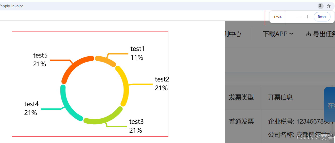
5.最终效果
三、总结
对于echarts渲染模糊,可以尝试改为 svg 方式渲染。
myChart.value = echarts.init(echartRef.value, null, {render: 'svg'})/*
希望对你有帮助!
如有错误,欢迎指正!
*/