这里以lepoco的wpf-ui为例
nuget上的包基本是开源的,但是除非是离线环境,否则不建议将包源码直接放到工程里。
下面的修改示例是针对直接使用nuget包的。
方法一、通过定义相同资源覆盖原始资源
例如修改ListBox选中项的背景颜色
首先我们在界面上添加一个ListBox,并添加几项
1   <ListBox>
2       <ListBoxItem>22222</ListBoxItem>
3       <ListBoxItem>33333</ListBoxItem>
4       <ListBoxItem>44444</ListBoxItem>
5   </ListBox>
运行效果如下

如果我们想修改选中的颜色,最简单的方案就是创建一个跟控件库中一样名字的SolidColorBrush资源即可。
我们打开wpf-ui包的源码,搜索ListBoxItem.xaml,然后找到这个资源名称,创建一个一样的即可。
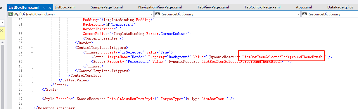
 1  <Application.Resources>2      <ResourceDictionary>3          <ResourceDictionary.MergedDictionaries>4              5              <ui:ThemesDictionary Theme="Light" />6              <ui:ControlsDictionary />7              8              <!--创建一个名称一样的资源即可-->9              <ResourceDictionary>
10                  <SolidColorBrush x:Key="ListBoxItemSelectedBackgroundThemeBrush" Color="Red"></SolidColorBrush>
11              </ResourceDictionary>
12          </ResourceDictionary.MergedDictionaries>
13      </ResourceDictionary>
14  </Application.Resources>
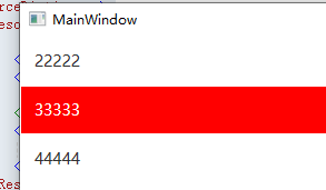
运行效果
方法二、动态修改控件模板
例如我们要修改Button的圆角。
首先我们在界面上放置一个Button
1 <Button Grid.Row="1" Content="Hello World" HorizontalAlignment="Center" VerticalAlignment="Center" Width="108" Height="38" Name="btn" Click="btn_Click"></Button>
然后我们想修改Button为圆角,
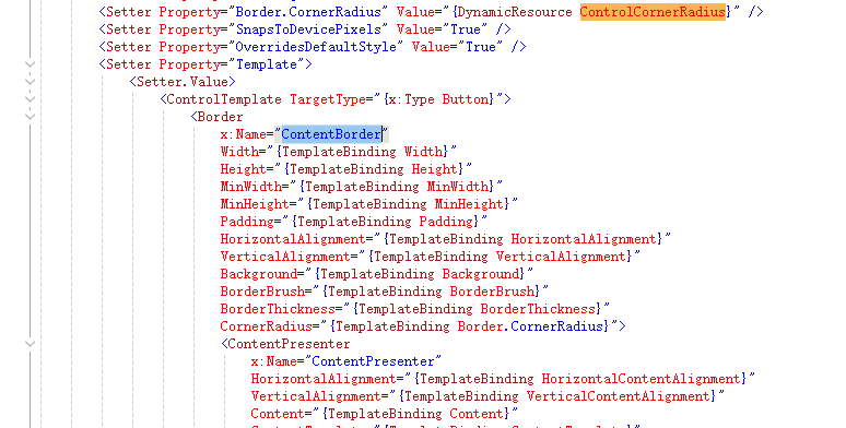
只需要找到Button.xaml,然后找到Button的控件模板,找到设置圆角的Border元素,并复制名称
然后通过代码修改CornerRadius值
1   private void btn_Click(object sender, RoutedEventArgs e)
2   {
3       var borderObj = btn.Template.FindName("ContentBorder", btn);
4
5       if(borderObj != null && borderObj is Border border)
6       {
7           border.CornerRadius = new CornerRadius(10);
8       }
9   }
运行效果如下:
方法三、通过继承样式,并设置控件模板
例如,当鼠标划过一个Button时,背景颜色通过动画变成Pink。
我们找到Button.xaml,找到Button的样式名称
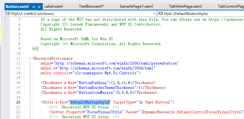
然后我们新建一个样式,继承自DefaultButtonStyle,再修改控件模板即可,这样我们能继承大部分的样式效果
 1       <Button Content="HelloWorld" HorizontalAlignment="Center" VerticalAlignment="Center">2           <Button.Style>3               <Style TargetType="{x:Type Button}" BasedOn="{StaticResource DefaultButtonStyle}">4                   <Setter Property="Template">5                       <Setter.Value>6                           <ControlTemplate TargetType="{x:Type Button}">7                               <Border8                  x:Name="ContentBorder"9                  Width="{TemplateBinding Width}"
10                  Height="{TemplateBinding Height}"
11                  MinWidth="{TemplateBinding MinWidth}"
12                  MinHeight="{TemplateBinding MinHeight}"
13                  Padding="{TemplateBinding Padding}"
14                  HorizontalAlignment="{TemplateBinding HorizontalAlignment}"
15                  VerticalAlignment="{TemplateBinding VerticalAlignment}"
16                  Background="{TemplateBinding Background}"
17                  BorderBrush="{TemplateBinding BorderBrush}"
18                  BorderThickness="{TemplateBinding BorderThickness}"
19                  CornerRadius="{TemplateBinding Border.CornerRadius}">
20                                   <ContentPresenter
21                      x:Name="ContentPresenter"
22                      HorizontalAlignment="{TemplateBinding HorizontalContentAlignment}"
23                      VerticalAlignment="{TemplateBinding VerticalContentAlignment}"
24                      Content="{TemplateBinding Content}"
25                      ContentTemplate="{TemplateBinding ContentTemplate}"
26                      TextElement.Foreground="{TemplateBinding Foreground}" />
27                               </Border>
28                               <ControlTemplate.Triggers>
29                                   <Trigger Property="IsPressed" Value="True">
30                                       <Setter Property="BorderBrush" Value="Silver" />
31                                   </Trigger>
32                                   <EventTrigger RoutedEvent="MouseEnter">
33                                       <BeginStoryboard>
34                                           <Storyboard>
35                                               <ColorAnimation Storyboard.TargetName="ContentBorder" Storyboard.TargetProperty="(Border.Background).(SolidColorBrush.Color)" To="Pink" Duration="0:0:0.5"></ColorAnimation>
36                                           </Storyboard>
37                                       </BeginStoryboard>
38                                   </EventTrigger>
39                                   <EventTrigger RoutedEvent="MouseLeave">
40                                       <BeginStoryboard>
41                                           <Storyboard>
42                                               <ColorAnimation Storyboard.TargetName="ContentBorder" Storyboard.TargetProperty="(Border.Background).(SolidColorBrush.Color)" From="Pink" Duration="0:0:0.5"></ColorAnimation>
43                                           </Storyboard>
44                                       </BeginStoryboard>
45                                   </EventTrigger>
46                               </ControlTemplate.Triggers>
47                           </ControlTemplate>
48                       </Setter.Value>
49                   </Setter>
50               </Style>
51           </Button.Style>
52       </Button>
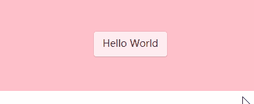
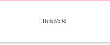
运行效果如下:
示例代码
下载